
Some Game UI Principles
Some rules I try to follow when designing UI June 18, 2020 Unity Game Design
Background
There was recently a thread on the 4X subreddit where someone asked for good examples of UI in 4X games. I spent a lot of time thinking about and responding to this post, even though the question was posed 10 days before my answer (the subreddit is slow-ish). Because I think the knowledge is generally useful, I wanted to excavate my response here, and also recommend that anyone looking to do 4X game UI (or UI in general) check out the thread!
My Game UI Principles
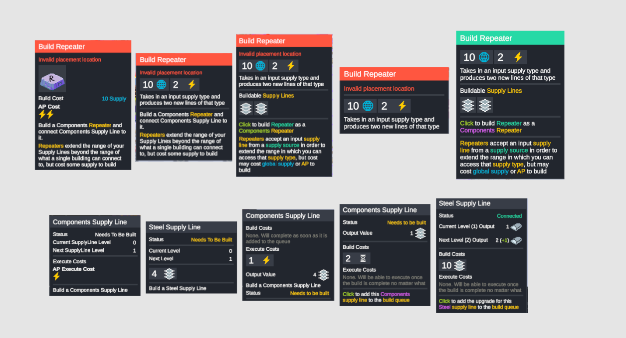
I’ve been working on Cantata for a long time and have been thinking a lot about the question of what constitutes “good 4X UI”. I gathered a ton of images from different games, and put them in a public moodboard you can check out here:
https://www.figma.com/file/Lrlg1ppR6NqCshsQ3h1a66/cantata-UI-references?node-id=0%3A1
One thing I learned from playing a lot of these games is that… 4X UI is generally bad. It’s often information dense, yes, but has almost zero sense of information hierarchy or really information design. It’s hard to tell what’s a button. It’s hard to tell how much a single button will open (Paradox games are particularly bad here, with small buttons opening up giant sub-menus that you didn’t know existed under that button). You only learn the UI by interacting with all of it and trying to figure out what each number means by mousing over it and hopefully getting some info.
My biggest learning is that, largely, the 4X community will grin and bear it if the game is good, but that doesn’t mean you should give up! However, 4X UI is HARD. I’ve redesigned my UI 3-4 times now and each time I do it feels like I’m programming an additional game in and of itself.
After looking at all these UIs though, I think my emergent favorite is Unity of Command 2 (not 4X, I know), or Total War: Three Kingdoms (4X adjacent). I also really like what Crusader Kings 3’s UI looks like, though I obv haven’t played it.
For Cantata, I ultimately ended up doing with a very minimalist UI that tries to be REALLY smart about what I’m showing/not-showing. It’s not skeuomorphic or overtly abstract, which I feel like would take away the focus on the pixel art. I’ll have a new devlog video up soon where I walk through it all, and I’ll be sure to post here (check my post history for some past iterations).
As a final note, I’ve tried to enforce a few things in Cantata that I think are applicable here:
- NO PIXEL ART FONTS. These look bad and aren’t readable. TextMeshPro gives you SDF fonts. Use these exclusively!
- Consistent indication of if something is a button or not. This sounds like a no brainer but it’s so easy to miss. All your buttons should look very similar, or if they look different it’s impossible to miss they are a button (placement location, etc.)
- Consistent Color Scheme! I try to use only about 8 colors total in the Cantata UI (outside of the art used to display Units/Tiles). This is both a creative and stylistic constraint, but what it means is that, if you look at a single UI panel in Cantata and know what colors normally mean, you can probably figure out what something means in a new panel without having to mouse over everything.
- Encode all information twice if possible. This is an information design concept, but basically consider any “value” - like health. When you’re displaying that, use at least two “dimensions” for encoding. So don’t just show the number (one dimension), show the number and have the number be a color that represents if health is high (green) or low (red). Or have a number get physically bigger or smaller if you have more or less health. This one is also hard with accessibility though, as it’s possible a dimension you choose (like color), will be hard for all audiences to literally perceive. But it’s also why you use two dimensions!
- Favor symbols over text. This is an efficiency for localization as much as a design decision. Symbols are the “language” of your game, and try to use them wherever possible. Symbols can convey a very complex topic with only an icon (or an icon and a number). If I’m looking at a design and trying to refine it, I think “how can I make this a symbol”. The UI is almost always better for it.
- “Blow it up”. I don’t really know how to explain this, but I suspect anyone who has ever made a strategy game can relate to this idea. It’s possible that when you’re designing your UI that you say “Okay I want to design this panel in the lower left corner of the screen”. Then you know you want to design something in the bottom half of that panel. And then in the bottom left of that panel. And so now you’re working in a screen space that’s about 1/32nd of your total screen real estate and trying to figure out how to put 10 very important numbers in a small ass area of your full UI. Whenever you feel like you’re doing this, try to “blow it up”. If those numbers are actually as important as you say they are, they should be much bigger and more prominent in your UI. This is very related to this talk Zach Gage did about “Three Reads” of a UI. http://stfj.net/DesigningForSubwayLegibility/
I disagree with parts of this, and largely think that, especially in strategy/4X games, people are unable to separate their knowledge of a game’s systems with how “good” they think the UI is (aka I think a non-strategy player would have no idea what they are looking at when they look at Into the Breach), but the point of designing for legibility still tracks. Surface your most important info, don’t accidentally bury it. This is also another Paradox problem - it’s really hard to see at any moment what’s actually “important”.
- Think about consoles. I know this sucks, as we all want to design elaborate 4X UIs, but if you’re interested in trying to go to a console at any point you need to be thinking about that now. This mostly has to do with traversal - ask yourself “how does a controller navigate this UI”.
Also just to bring up some points from users below that I definitely agree with:
Have your design responsively scale to the user’s screen resolution and viewport size. (This is hard to do if you don’t plan for it from the start as well. REALLY learn your system’s UI system and make heavy use of proper pivot points, layout groups, etc.)
Concatenate/abbreviate/round data and numbers where viable.
When dealing with detail views of a series of entities, e.g. viewing planets or cities one at a time, allow the player to cycle forward and backwards through the list without having to exit the details view (This was a big point of feedback from players even in the earliest alpha stages.)
Have the minimum relevant info presented and hide most stuff just one click down, makes a huge difference.
However I would argue that having a super high level of UI is not a priority. The more glaring issues I often find is lack of hotkeys and lack of accessible information in tooltips or info screens. (Tooltips are HUGE! Have a plan for implementing them and do it from day 1. I use attributes to procedurally generate mine.)
Thanks for reading!
Date
June 18, 2020subscribe to my newsletter to get posts delivered directly to your inbox